It is Halloween time again. This year I thought about an elegant home decor again, with shiny surfaces, classy-looking wreath, mat black pumkins decorated with silver pearls, with a bit of white and LED-lights thrown into the mixture. If you use much black, it is still scary!
Tuesday, October 31, 2017
Friday, July 7, 2017
Reasons Why Moodboards Are Not Enough
Let's see how the last moodboard could be turned into a 3D illusion.
It is different, isn't it? I had to add a coffee table, a pouf, a rug, some cushions and a floor lamp, and had to create a wall and floor. The original idea is carried out in a certain style here, but should you change the floor or the wall (darker grey for instance?) you may get a more masculine expression.
As you see, the original moodboard is a good starting point, it may lead to several design solutions, and still this set could look different from home to home.
Some people have the ability to translate a concept into their space, others do not - but that is why interior decorators exist. My aim is to inspire you and give you ideas that you can use in your home.
It is not worth living a life without style.
Wednesday, July 5, 2017
Reasons Why Moodboards Are Enough
As I had said in my introduction - it feels like a lifetime ago - I love moodboards: I feel it gives a little extra compared to an average 3D rendering, as it presents you materials and a different point of view of the interior project.
Strictly speaking not everything I make here is a moodboard - some of them can be considered as an illusion of a 3D drawing or a concept board or design board - whatever nametag you wish to put on it.
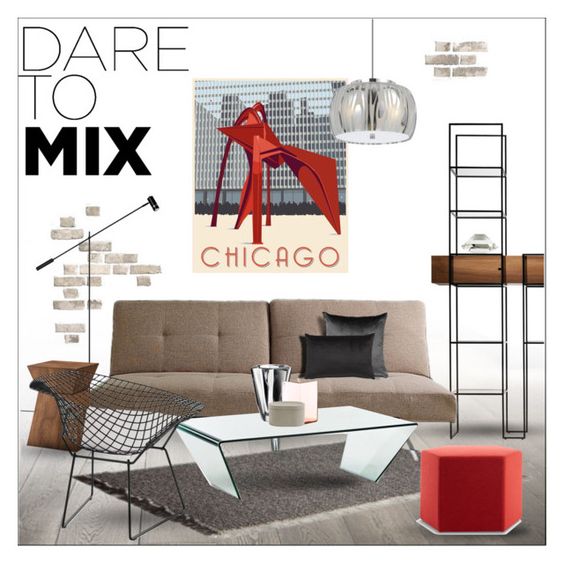
Moodboards do not necessarily give you the exact picture of the design. It shows you materials, colours and pieces of furniture, but it does not allow you to feel the space, only the mood of it.
Let's take the example below.
You can see some of the furniture used - sofa, armchair, shelves, a decorative poster, a lamp and a side table, with some accessories thrown into the mix.
You can see the colours - grey, brown, pop of red - and materials - glass, metal, walnut wood, leather -and even pattern (grid pattern dominating).
I think it gives you the idea of a modern, urban apartment with pops of colour, but you can not see the space, the placement of furniture, the walls, the floor, how all these elements of the interior interact with each other.
It means that based on this moodboard you will not be able to furnish your apartment, it only serves as an idea board that must be tailored to your space. Moodboard is an excellent tool to help you to decide what style and colour scheme you want to use, so keep it on your mind when you are brainstorming.
Friday, June 2, 2017
A very personal note
I know, I have been very quiet lately. This year so far has not been easy for me. After a short, but very painful battle with cancer my father died in January. I am not going to give up this blog, so I will be back soon. Thank you for follwing me.
Sunday, April 16, 2017
Easter Decor
Happy Easter everyone! Spring is in full blossom, but who said that Easter decor can only be pastel coloured? I chose a bit of a Scandinavian approach to this year's decor with all the white flowers, black and white graphic patterns, blackboard and natural wood. It is a very subtle but sophisticated look for this time of the year. Enjoy!
Friday, April 14, 2017
Styling Greenery - 3
My last take on greenery. As I mentioned, you can bring colour into your home in three ways. The easiest - and arguably the most budget friendly - way to refresh your home is getting new accessories. (Painting your wall could be another - although more expensive - option, if you don't mind the fuss.) You can replace paintings, small tables, cushions and decorative objects any time with new ones, thus creating new atmosphere from time to time.
Green looks lovely with pink and purple, but again I found that greenery simply needs some black to stand out, to really show its vibe. I found this beautiful rug with worn effect, and immediately employed it because the white pattern makes it so much lighter and more playful. Should it be plain without pattern, I would have considered too much in this colour.
The overall effect is light, eclectic, slightly bohemian and utterly cheerful.
Wednesday, April 12, 2017
Styling Greenery - 2
I promised another styling for greenery, Pantone trend colour of 2017. This time the styling is made for a man, who owns a lofty, industrial-style apartment.
Compared to my previous moodboard, now greenery appears on a smaller surface, namely the armchair bean bag, backed by some cushions and a lamp.
Apart from these colour spots we only see black, distressed wood, metal and brick, all signature elements of loft style. As green is the only colour used, the overall effect is more sophisticated, but still fresh. Wall marquees and a tripod lamp complete the industrial look.
I would like you to notice the sofa. Michel Ducaroy designed it for Ligne Roset in 1973. It is very 70s, but this time I resisted the temptation to style it in a retro way, and rather enchanced its comfy feel.
The next and last look for greenery - no surprise here - is going to be designed for a lady. Stay tuned, it is coming on Friday!
Subscribe to:
Comments (Atom)


