Wednesday, June 29, 2016

Color Combination: Blue and Orange

Some people like colours in the room, others completely avoid them. These people usually say that you will get bored with colours soon. I disagree. You just get accustomed to it, and it can happen to any colour scheme. So do not be afraid to express you personality with colour. Just use them wisely. 
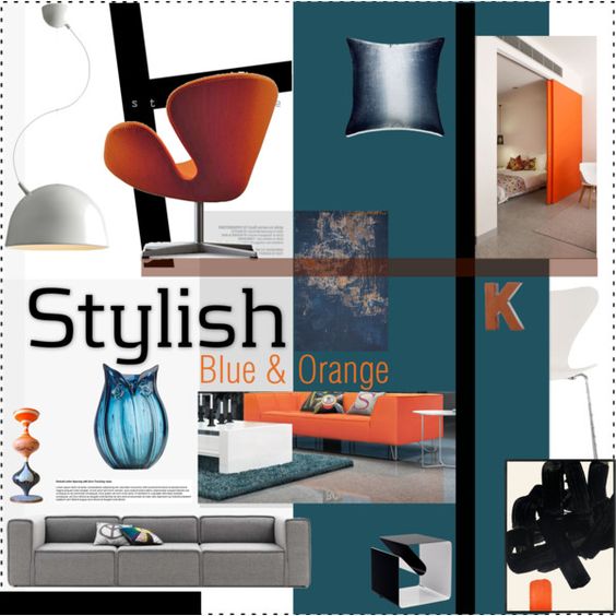
This is the second moodboard in the colour combo series. As you might know, blue and orange can be found on the opposite parts of the colour wheel and called complementary colours or opposite colours. They are very powerful together, especially when used intensively, so the key to a stylish look is the smart proportioning of colours. I would suggest playing with bright vibrant tones with muted ones, as it is easier on the eye. Bright orange sliding door could look fantastic against darker, toned down shades of blue on less extensive surfaces, like cushions or chairs for instance. You can use lots of neautrals - they will emphasize the striking colour clash. 
Interior Moodboard
For this colour combination, I had the image of an airy, lofty interior on my mind, with lots of white and streamlined furniture. There are actually many possible variations, let's see a couple of them:
- Take a bright orange sofa, white furniture, blue rug and lots of neutrals. If you use this mixture as a jumping off point, I would suggest a grey armchair. Some parts of the wall could be painted blue, or you can use blue backsplash or blue dining chairs. 
- If you are unsure about the orange sofa, why don't you pick a grey one? Add an orange armchair - this one is by Arne Jacobsen, the famous Swan -, blue rug and some small blue accessories. The dining chairs could be also white, and in the photo a huge sliding door reflects the colour of the armchair. 
- If you are still undecided, you could play with the accesories only. Settle for the blue rug, and use orange in small proportions: on a piece of art, a splash of colour in the paining, etc. You can play with various tones of one colour - using faded blue rug with electrifying turquoise could have a huge impact. 
I can imagine artistic objects, graphic lines for this style, it has certainly a contemporary edge. For real persons with real character. 

Sunday, June 26, 2016

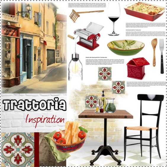
Concept Board - Italian Trattoria

I already mentioned how much I love dining out. I enjoy having a delcious meal in nice setting in good company, perfect way of combining food, friends and interiors. In my last post I promised to take you somewhere else, far from Scandinavia. I also mentioned pasta, so here we are, in a nice little trattoria straight from Italy. 
Interior Moodboard
It does not matter if it is a casual or an elegant establishment, Italian restaurants seem to incorporate colour red and rustic dark wood into the interior. Here I did the same, but I chose a laid-back appcroach. The key style elements are mix-match furniture and dinnerware, flatware made of dark wood and steel, colourful tiles and fumed oak floor. My goal was to create an Italian country mood, that could be your inspiration for a new restaurant, but it is also easy to recreate this mood in your home.
***
I hope you have a lovely Sunday afternoon. Next week I will be back with a post about another colour combination, and as it is summer, you can expect a summer themed post as well.

Friday, June 24, 2016

Scandinavian Styled Hallway

It is easy to love Scandinavian style for its natural and cozy touch, yet it is not difficult to copy (not because IKEA can be found almost everywhere). 
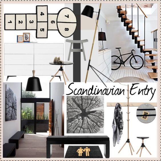
If you look around for Scandinavian inspiration, you will find that there are slight differencies in Scandinavian style; Swedish, Norwegian, Danish and Finnish interiors have their own characteristics, but of course they have certain elements in common. I tried to capture these elements in one moodboard, presenting you a universal Scandinavian styled entry that could fit into any Nordic home. Let's see those elements here. 
Interior Moodboard
The use of white is common in interiors, both on walls and floor, as it helps to expand the sense of space. Winter nights are endlessly long and dark, this is a way to preserve light, too. Wood is usually brought in, and somehow light coloured types, like oak, are the popular ones. For a bit of contrast, you can always use a bit of black, or alternatively you could try grey. (There are fifty shades of it, at least ;) )
I love the simplicity of the interiors above. In the photo on the right, the decorative staircase dominates the hallway, while the eye-cathcing photo art has a huge impact in the other. The picture of the trunk also brings nature in, and Nordic people love a natural touch - exposed wood, felt, wool and fur can be seen in their homes. There is no need for eye candy, honest materials and simple lines speak for themselves. 
Unusal forms might give the hallway a personal edge - do not be afraid of trying something new. How do you like the floor lamp? It certainly has a personality - look how strutted it is! Or check out the hopscotch rug, perfectly sized for hallways: it is cheeky and fun - and not just for adults. At first sight, the pendant is also a classic - but it has a handle. Have you spotted the hallstand in the photo on the left? It looks like as if it was inspired by the mikado game. 
You see? There is no reason to neglect the entry - after all, it gives you the first impression of your home!

After this cool Nordic breeze my next moodboard on Friday will direct you somewhere else - I hope you love pasta ;)

Wednesday, June 22, 2016

Colour Combination: Turquoise and Silver

This moodboard is the first of a series where I will show possible colour combinations for your home. I always say that if you want a balanced and stylish interior, but you are unsure about the outcome, pick just 2-3 colour you love, and use them with neutrals. Coordinating more than three colours really does require more skill.

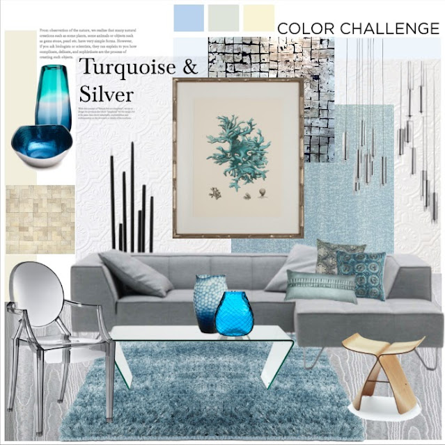
Today's colours are turquoise and silver - together they create a calming, elegant and cool mood, perfect for summer. As you see I used them on big surfaces - silver on the sofa's fabric and turquoise blue on the rug. I chose glitzy blue wallpaper, to unite the shine of the sofa and the colour of the rug. Do not cover all the walls with coloured wallpaper, just a smaller section or one wall. 

Other materials used are smooth and shiny glass and acrylic, sparkling chrystal and some wood. For the floor I chose a greyish tone, completely neutral and calming. If you like this colour combination, yet you find it too cold for your taste, try adding warm wood. Just by picking walnut floor you can warm up the entire room. However, in this moodboard I went for a cool look, so I only added some wooden accessories in light oak.
interior moodboard
The black floor candle holder is my favourite, it has a sculptural look, and its diverse height harmonizes with the pendant. The Ghost chair would look magnificent with an oak dining table, but you could also pick a table in glass and metal. The vases have lively, deep blue tones and call for attention. The cushions unify the lead colours.

How do you like this combination? Do you prefer it without wood, or on the contrary, would you warm it up?

Sunday, June 19, 2016

Happy Father's Day!

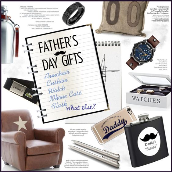
Let's celebrate Father's Day with this moodboard. What do dads want for this special day? More time with their children? Or on the contrary, finally some time alone? Here are some gift ideas for fathers, but remember, the best gift you can give to the person you love is the time spent together!
Moodboard

***

Next week we are going to talk about hallways, colour combinations and I will show you the first commercial concept that many others will follow. 

Friday, June 17, 2016

How to Chose and Style Your Sofa?

Would you argue with me when I say that the sofa is the most important element of your living room? After all, you live your life on it: take a nap, drink coffee, watch TV, make phone calls, read books, use your laptop and entertain guests. 
What do you have to consider when you are thinking about buying a sofa? A lot depends on the size and shape of your room, and thankfully most sofas are available in many sizes and shapes to meet various needs. Today I am going to write about comfort and style only. 
First, take your time to find out what do you expect from a sofa. It sounds simple, but it is not. You will realize that sofas comfortable to you are not comfortable to others. Let's take an example, point number one, regarding seat depth. Tall people tend to like sofas with bigger seat depth; not so tall people prefer narrower seat depth. This is a tendency, but do not rely on it all the time. I am tall enough, yet the best sofa I ever tried was a narrow one. It supported my back like no other sofa did. Which leads to our second point, back hight. 
You might need proper neck support if you watch TV, which means you have to consider highback sofas (can be visually overwhelming) or adjustable ones (usually more expensive). It depends on the placement of the TV and your habits whether you actually need highbacks. The best for your neck is when the screen is placed just below your eye-level, so the head is bent down a bit. If this is the case, you might not need that extra support, but a higher back might still be adviseable. 
The third point is about the armrest. Many armrest shapes and styles exsist. You can even sit on a wide arm, or place a tray on it. A high armrest is more convenient to put your arm on, a low armrest enables you to place a cushion on it and take a nap. Thin armrests may be uncomfortable, but do not take up much space visually. Lounge units lack armrests, but beware of all open-end sofas - they might be inviting, make the space look bigger, they are stylish, but at the same time they do not offer the same comfort. Sloped armrests are useful if you take a nap really often, otherwise stick to the normal ones. Other armrests tell a lot about the style of the sofa, like rolled arms, pleated arms, etc. 
Seat hight is also of vital importance. Elder people like it higher, while young ones find lower sitting more appealing. This one is really up to you, there is no optimal height. 
The filling of the sofa can be varied. Some sofas are very soft, others are a bit more firm. Even sofas with thinner seat cushion can be surprisingly comfortable. However, the quality of the filling is important. Foam is popular filling material, comes in various density and quality and is made of chemicals. Some foams are more resistant and regain their shape more easily, like High Resilient foam, others, like PUR foam collapse a bit over time on areas you sit frequently, as your weight presses the air out from the cells. Some fillings contain feathers or down - consider this in case of severe allergy. Other sofas have fibres making them soft. Cushions filled with fibres of feathers need plumping often so that the air can return back to the fibres. Some fillings have mixed ingredients of the three above. It is a good solution, as this way the benefits of the ingredients are combined. 
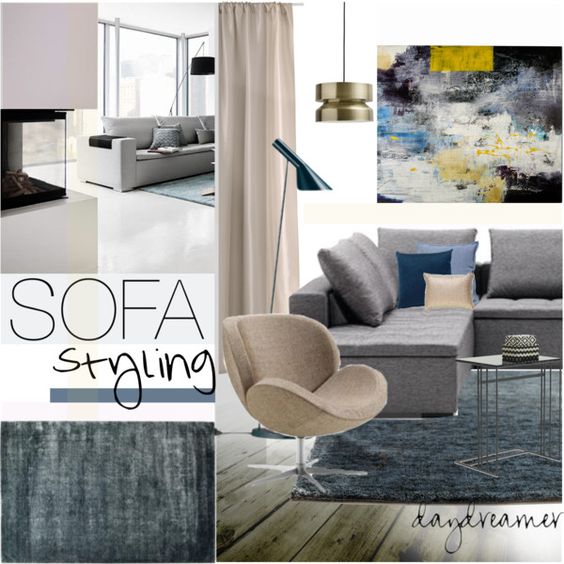
Moodboard
As you see, there are no strict rules on sofa comfort, but there are guidelines. These are:
- seat depth
- back hight
- armrest hight and shape
- seat hight and
- filling
(Remind me I need to write more about sofa choosing tricks later.)

Visually, the sofa can be the focal point of your room. If it stands against the wall, make sure there is something eye-cathcing above (interesting painting, eye-catching shelves) or behind (textured 3D wall or wallpaper). If it is free-standing, it creates visual entity with the rug, the coffee table and the armchairs. I usually recommend using freestanding sofas as a room divider or in spacious rooms. Two freestanding sofas can be facing each other and form an island. You can higlight it with a dramatic chandelier hung above the coffee table.
Big surfaces, like rugs, wallpapers and paintings can pull the colours of the room together. In this moodboard this task was given to the painting. You can accessorize your sofa with cushions, plaids, but consider choosing a good reading lamp, magazine holder or a side table. These days there are many tables with storage function, they help you to keep the room tidy.
For some time the beautiful blue rug above has been my favourite, it goes well with the pastel shades. This colour combo oozes elegance and tranquility -the perfect place to wind down after a hard day.

Wednesday, June 15, 2016

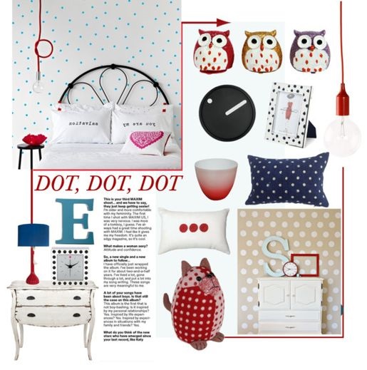
Dot, Dot, Dot...

As it turns out, I am passionate about dots. In spite of not having one single piece of dress with dots, I tend to use them in interior decor. Dots can be cute and girly, utterly feminine in a vintage 50-s way, and also very retro, if used in big size and bold colour.
Here I had a little girl's room on my mind. Remember to use dots on one big surface only, and let them appear moderately on small accessories. That's the trick.
Moodboard

Sunday, June 12, 2016

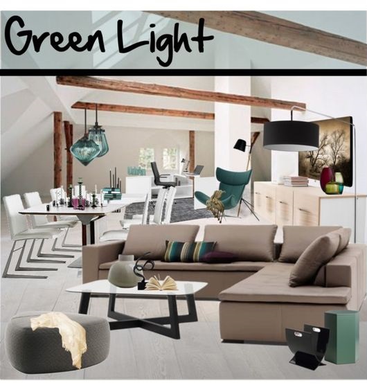
Green Gets the Green Light

As I said earlier, green is definitely in. This time I made a light, spacious Scandinavian interior, with forest green accessories. I also added a bit of purple to make it more alive. Enjoy!
Moodboard

Friday, June 10, 2016

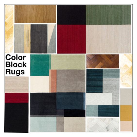
Block the Color! - The Color Block Rug Guide

Colour blocking, that first popped up in fashion, has been a trend for some time and finally made it to our homes. Some people associate the origin of this style with artist Piet Mondrian, famous for his geometric paintings using bold bright colours. 
And now we got straight to the point - colours. The tones used in this sytle are mostly opposites on the colour wheel, making interesting combinations. I think you have seen a fashion outfit in this manner. But how do you translate it to the language of interior design? 
Unless you want your home look like as if a unicorn inhabited it, be aware of your colour choice. The secret of stylish color-blocking is using only 2-3 hues paired with neutrals. Add more neutrals than you would add to a fashion attire. 
In interior design you can use this style in three ways: 
1) - on the wall. Considering how easy it is to make a bad choice in case of one single colour, let's not get into this one. 
2) - on furniture. It might look very well on big, geomteric shaped surfaces, but I have not seen many good examples. It is more difficult than in case of wall colour, proportions are of vital importance, therefore you need professional consulting. 
3) - on the floor, as a rug. This is the safest choice, as the designer of the rug has already made it for you. Just pick the combo that suits you the best. If you are unsure about contrasts, get one where the colours complement each other. 
Let's see some nices ones here.  
Moodboard
Make sure you do not place heavy-looking furniture covering them - the rug might loose its character. Accessorize the room in a way to keep the color scheme.
These rugs look fantastic in minimalistic home settings, however, if you want to modernize mid-century interiors, go ahead. This rug will suit both. 

Wednesday, June 8, 2016

Kitchen!

Let's be honest, I am not a great cook. I am simply not natural. But I like to eat, dine out and be spoiled rotten by fantastic meals made by my friends who can actually cook.
However, it does not mean that I do not know what makes a well-organised kitchen. The layout is very important, and I am always amazed how easily it is overlooked by some people. The layout is everything. It determines how fluently you can work. I could easily fill a couple of posts alone with this topic, but not now. Today's post is about styling. 
This is the first kitchen moodboard I made.
Mood Board

The inspiration for this mood board comes from the well-known restaurant-chain, the Vapiano. Imagine a clean-cut spacious kitchen, with light brown wood (lots of wood), metal machines, herbs in pots, some red accessories, and you get the picture. Probably due to the use of red it has some Italian vibe. 
How do you like the trolley? Do you use it in the kitchen? I think it gives a professional touch to any kitchen.

Sunday, June 5, 2016

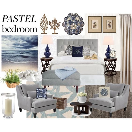
Pastels in the Bedroom

It has been quite rainy in the past week, and although it is June, I have not seen much of summer yet. This is the time when students take their school leaving exams - in my country school ends around mid-June - and I remember that my first days after my exams were always spent with reading a good book (especially that the weather was unpredictable and rainy). One of my favourites were crime stories that my father had a good collection of, mostly by authors active in the 60s and 70s. I remember one particular novel set in France in the early 60s, where the herione drove through France down until the South coast with criminals in her pursuit. I can still see myself, lying on the bed, book in my hand, not caring about the rain outside, totally immersed in the plot, and in my mind the sea shore in South France was also cool, cloudy and deserted.... just like in that photo above.
To make a long story short, as you see, anything can be inspirational, and sometimes inspiration comes from the most unexpected places.
Moodboard

This bedroom is a sanctuary, the perfect place to sleep, relax, and read books. The colour scheme I chose reflects the photo - calming greys and light blues, sandy colours and a bit of rich brown. Dark blue accents make the room look more alive. For a touch of luxury you can also place armchairs in the bedroom if you have space. And now... relax!
Anyway, the book is titled 'The Lady in the Car with Glasses and a Gun' written by Sébastien Japrisot.

Friday, June 3, 2016

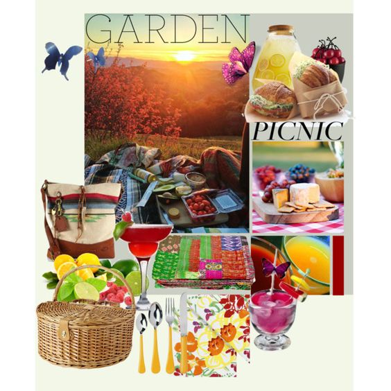
Garden Picnic

Mood Board
The last couple of days were a bit rainy. I do not mind rain, but I do look forward to spend more time outdoors. I do not mean hiking, I mean having a picnic in the park, hillside or even the far end of your garden. Just out of the house. Go and grab a colourful blanket, pack your basket with goodies: homemade sandwiches, lemonade, fruits, anything you like. Make it a lazy afternoon, just enjoy the lovely weather and each other's company. Take your time.

Wednesday, June 1, 2016

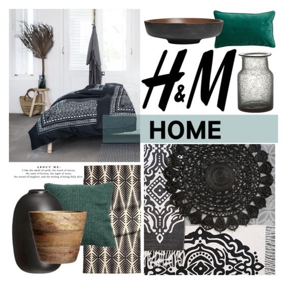
Why to be careful with the HM Home 2016 spring collection

Mood Board
Green is definitely in, also in the H&M Home collection. This spring's assortment was all about jungle, leaf motifs and lots of green. And I am not sure whether I love it or not. (Most likely not.) Ethnic trends are always present, tribal patterns look fantastic in black and white, adding green and wood also works, but unless you are a workaholic jungle researcher or owner of a Hawaiian themed B&B, be careful with palm motifs. You buy it, you get bored with it, you do not use it any more. It is just too themed and has 'H&M Spring 2016' written all over it. Above are the items I could invest in, and would not regret having next year.